Week two of school down. One student in this house is getting settled into his new school (he is a teenager so I don't get much from him one way or another), one is ecstatic about his new school situation (6th grade accelerated classes and all that comes with it - I think he is happy to shed the restrictions and dullness of elementary school) and the youngest seems to be happy at school, but also seems to be sick with something... great, the elementary germ parade begins. At least she is happy laying around reading her new Kindle (birthday gift) and if she gets tired of that there is the huge stack of books she checked out from the library with her
very own library card yesterday.
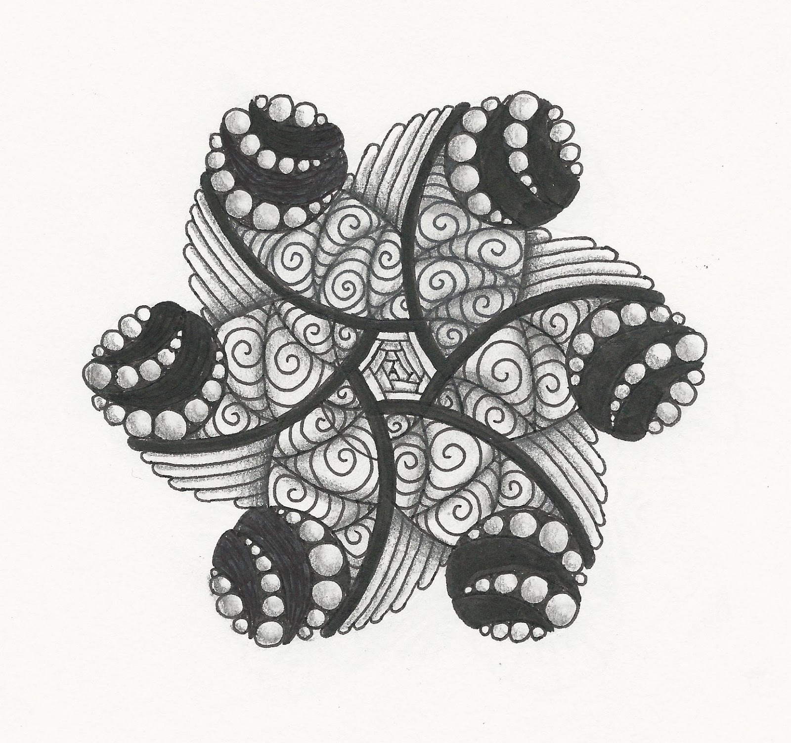
We spent last night eating dinner and watching a movie as a family and that meant drawing time for me. So I pulled out the Zendala template for the
Diva guest challenge this week - Erin and her Zendalas... how their regular appearance has been missed while she studies away for her nursing degree! Here my interpretations are...
 |
| This one did not work out as planned, but with some alteration it is growing on me. In a month I might actually like it. |
 |
This one feels about how I wanted, I might thicken some of the flower petal lines in places to give it a bit more drama.
Edited: this is the altered version:
|
Earlier this week I worked on a small piece to replace
the one I ruined last week that was supposed to go on the front of a card. It is done on brown paper and I am always surprised at how dramatic a change is affected by adding the white to those. I scanned it before and then after to capture the change.
 |
| Before |
 |
| After |
That is about all the time I have. There is, of course, grading to be done, laundry... all the usual. See you next time.


Oh, I love both of your Zendalas but the brown pictures with the white in it is awesome!
ReplyDeleteIt looks really dramatic!
beautiful zendalas, the second is my favorit
ReplyDeleteBoth zendalas are beautiful!
ReplyDeleteLike Ulrike, the second is my favorite; it's so 'friendly' and clean. In the other piece you can really see the difference and what the highlights can do.
ReplyDeleteYes, indeed, the choice of the plot we have with you the same :) Amazing! :)
ReplyDeleteYour zendalas very beautiful.
It is like the picture on the kraft paper - with white, he gained an incredible volume!
I love your two zendala's - it's a great show of how the same template can look so different. I prefer the first one because I like how you have done the purk in the circles and the balanced the heaviness of them with the delicate paushalov (sp?). And I love seeing the difference the white highlighting makes in your dark brown paper… WOW!
ReplyDeleteThe edited zendala really does 'pop' more now. I really like it. And the white added to the brown piece is gorgeous!!!
ReplyDelete