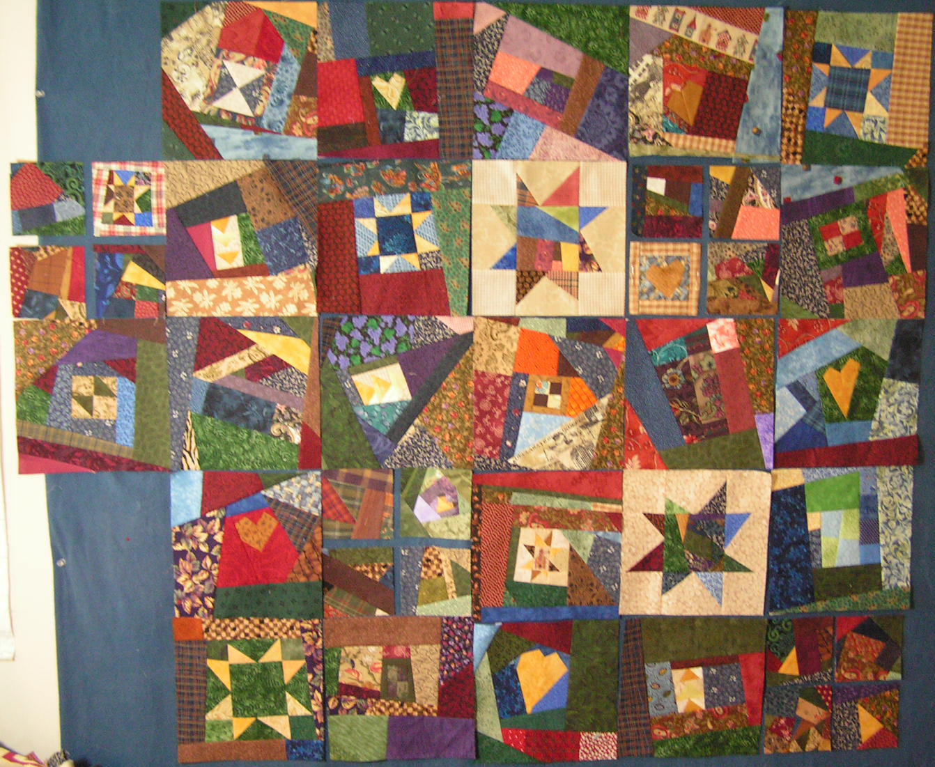
Happy Monday (OK, I admit, I a trying to convince myself)! I have a few things up on the proverbial wall this week (sometimes it is the actual wall; sometimes it is my head and for photo purposes it is often the floor in front of the front door. First, I am compiling quite the stack of crumb blocks participating in the
Crumb Along over at Jo's Country Junction. They are teaching me a few things about my sewing and myself, but that is another post for which you can check back later in the week! I decided to throw them up on the wall to see what is working and what is not and what I need more of, or less of. After all, that is what design walls are for, no?
I like the individual blocks for the most part. I think they are pretty dark all up there together (and the navy flannel wall doesn't help). I am looking for some design elements that tie the whole
mess, I mean
quilt together. I have 8.5" and 4" blocks to work with. I like the hearts, I like the stars, I like some of the blocks that have a 4 patch some where in the center. If I make some of the 4" blocks into the centers of wonky stars with light neutral surroundings that would lighten things up, but would it be too blocky/blotchy? Right now with just the two it interrupts the flow of things. I wonder if it would be better with more or worse? They would stand out in a big way and look like stepping stones and that would make their placement critical. It would mirror the wonky stars in the 8.5" blocks and hence be a unifying element. I could also take sets of 4 of those 4" blocks and set them with sashing to look like a 4 patch/window pane. I like the variation in size of the crumb unit and the orderly setting and it might pickup a connection to the blocks with 4 patches in them. I might need to make a few more big blocks with 4 patch centers and make them a little more obvious. The sashing of those sets of four is a subject for debate also. Probably something on the lighter side, but not too light or that is all that you would see (here it is the wood floor which is clearly not enough contrast!).

Clearly lots of decisions and block still to be made. I wonder how big this thing will end up being and how on
earth an I going to quilt it? Nothin' like an open ended project to keep you on your toes.

I also need to decide on flower centers for the Tweets block I am working on. I am steadily sewing on it while waiting on children at lessons and I am about to the point where I need to decide. This is the first time I haven't decided ahead of time on the colors to use on ALL the parts. I have done variations on purple and gold for lots of flowers in this series so I was trying to stay away from that. Dark purple is an option, gold of course and maybe a soft pink or a darker pink? What do you think?
Oh, and for those that commented last week about the camo Birds in the Air block, I went with the red despite the lack of contrast issue. The red just looked snappier. The gold had better contrast, but there are enough earth tones in the camo that it just did nothing to set the block off colorwise. Thank you so much for the input.


I am nervous to put my blocks together to see what it's going to look like!
ReplyDeleteI really like your golden heart blocks! And I think if you made more stars on a light background you would like it better!
It's looking good. It could stay just as is and keep going, or you could add more of the stars...personally, I love the stars.
ReplyDeleteI'm not participating in the crumb along so not sure if you have guide lines for assembly. I made a crumb quilt at the beginning of the year. I pieced my crumb blocks together into a 9-patch block and then sashed them with a solid-to sorta calm them down-just one thought. Your blocks are fantastic and however you put it together it will be terrific.
ReplyDeleteSimply.......WOW!
ReplyDeleteglen
I love it and think that you have some great blocks there. I like it without sashing. What about On point? It would take away the "blocky" feel you mentioned. I think this is going to look great no matter how it is set, how big it is, etc. Sometimes I just let the quilt take on a life of its own without tons of planning...
ReplyDeleteLove your crumb blocks. Your color choices are great.
ReplyDeleteYour crumb blocks fascinate me, but I wouldn't know where to start to suggest how to set them. With your applique, I like the deep pink centers, they show up, the others tend to blend in. However, I would consider doing a variety of centers, not all the same.
ReplyDelete